
10 Common DIY Graphic Design Mistakes Small Businesses Make
Running a small business in New Zealand means wearing a lot of hats. One minute you are handling customer support, and the next you are acting as your own marketing department.
DIY design tools have made it easy for anyone to create flyers, social media posts, and promotional banners. But without formal design training, it is easy to fall into simple visual traps.
A cluttered flyer or a hard-to-read social post can make a fantastic local business look amateur.
The good news?
Fixing these design errors does not require a university degree.
Here are 10 common DIY design mistakes small businesses make—and simple ways to fix them.
1. Using Too Many Different Fonts
When you open a design editor, exploring hundreds of free fonts is exciting. But mixing four or five different font styles in a single graphic creates visual chaos.
- The Mistake: Using a script font for the headline, a bold serif for the subhead, and two different sans-serif fonts for the body text.
- The Fix: Stick to a maximum of two fonts per design. Use one bold font for headlines and one simple, clean font for body text.
2. Ignoring Visual Hierarchy
Visual hierarchy is a fancy term for guiding the reader's eyes to the most important information first.
- The Mistake: Making every line of text the exact same size, color, and weight. The reader does not know where to look first.
- The Fix: Make your main message (like "50% OFF SALE") the biggest item on the page. Secondary details (like dates or addresses) should be visibly smaller.
3. Forgetting About "White Space"
White space (or negative space) is the empty area around your text and photos. Beginners often feel the urge to fill every square inch of a canvas with extra shapes, starbursts, or text.
- The Mistake: Crowding the edges of the canvas and squeezing text blocks tightly together.
- The Fix: Let your design breathe. Empty space gives your content room to stand out and makes your layout feel clean and professional.
4. Poor Colour Contrast
If your text does not contrast sharply against your background, people scrolling on a phone screen will skip right past your post.
- The Mistake: Placing dark blue text over a dark photo, or light yellow text over a white background.
- The Fix: Always use high-contrast combinations. Dark text belongs on light backgrounds, and white text belongs on dark backgrounds. If you place text over a busy photo, add a semi-transparent dark box behind the lettering.
5. Stretching Photos and Logos Unnaturally
Nothing screams "unprofessional" faster than a distorted company logo or a photo where people look unnaturally tall and thin.
- The Mistake: Pulling the top, bottom, or side handles of an image box to force it into a blank space.
- The Fix: Always hold the corner handles when resizing images or logos. Dragging from the corners scales the height and width together, keeping the original proportions intact.
6. Centering Long Paragraphs of Text
Centering text works fine for short headlines or three-word titles. But centering full blocks of text makes reading difficult for the human eye.
- The Mistake: Centering three paragraphs of body text on a flyer or website banner.
- The Fix: Left-align paragraphs of body text. Left alignment gives the reader's eyes a consistent starting point for every line.
7. Using Low-Resolution, Pixelated Images
Downloading a tiny thumbnail photo from Google Search and blowing it up on an A4 poster turns your image into a blurry block of pixels.
- The Mistake: Using low-quality images meant for tiny web screens on large digital banners or print materials.
- The Fix: Always use high-resolution source photos (300 DPI for print, or clean 1080p+ images for digital graphics). If a photo looks fuzzy on your screen, it will look even worse when published.
8. Not Sticking to Brand Colours
It is tempting to pick new, fun colours every time you start a new design. But changing your colour scheme every week destroys your brand recognition.
- The Mistake: Using bright neon pink on Monday, pastel green on Wednesday, and navy blue on Friday.
- The Fix: Pick two or three core brand colors and stick to them consistently across every graphic, flyer, and social channel you use.
9. Designing for Desktop Instead of Mobile
Over 80% of your local customers view your social posts and website graphics on a mobile phone screen while on the move.
- The Mistake: Putting tiny details, small phone numbers, or thin cursive text on a social post that becomes impossible to read on a small screen.
- The Fix: Keep your text bold, simple, and large enough to read easily when zoomed down to the size of a smartphone display.
10. Skipping the Final Proofread
Spelling mistakes, wrong phone numbers, or outdated dates ruin an otherwise perfect graphic.
- The Mistake: Exporting and publishing a flyer the second you finish moving elements around.
- The Fix: Step away from your design for 10 minutes, then review it with fresh eyes. Check your phone numbers, opening hours, event dates, and website addresses character by character.
How Dzyn Space Stops Design Mistakes Before They Happen
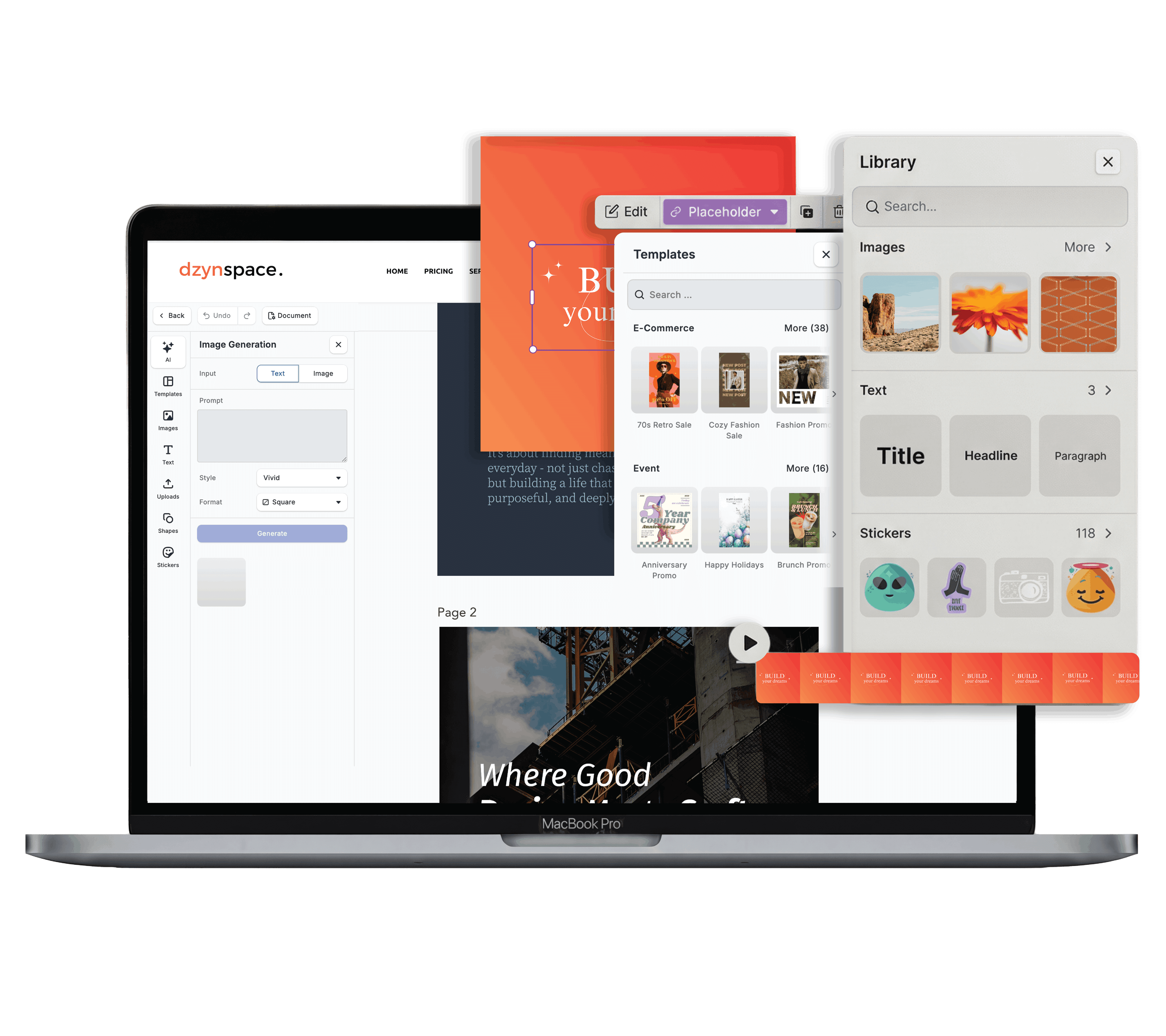
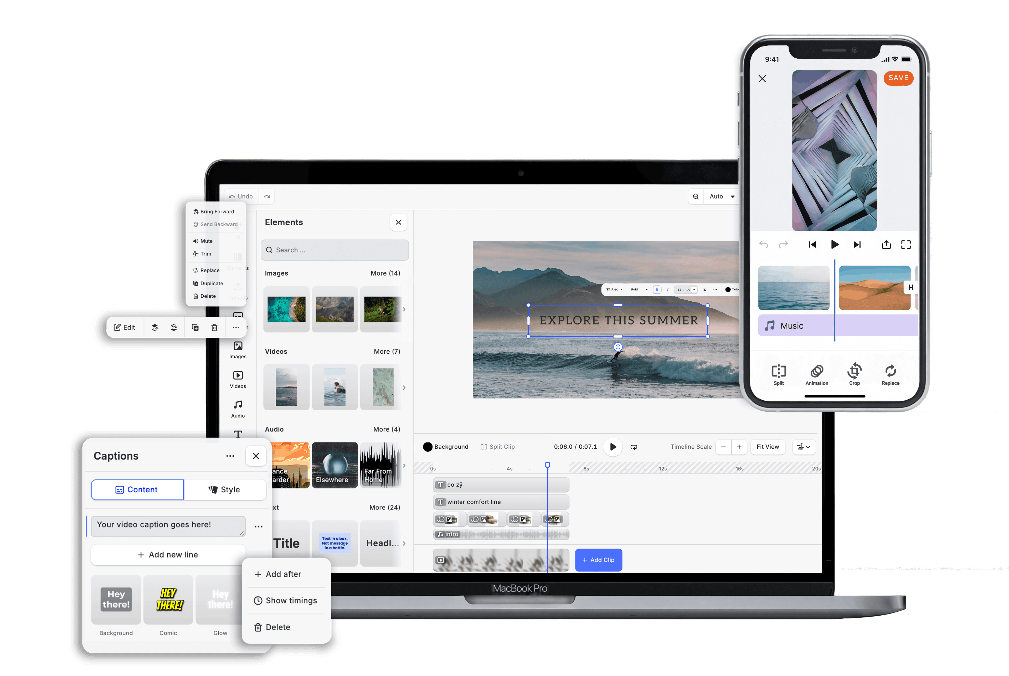
You don't need to double-check every design rule manually. **Dzyn Space** keeps your DIY marketing graphics on track effortlessly:
- Brand Kit Centralisation: Pin your official logo, custom fonts, and exact brand Hex colours directly into your editing sidebar so you never accidentally use the wrong shades.
- Pre-Formatted Layout Hierarchy: Start with professionally designed templates built with perfect font pairings, proper white space, and correct text alignment out of the box.
- Smart Alignment Guides: Built-in snapping lines show you exactly when your text boxes, logos, and images are centred and balanced on your canvas.
Frequently Asked Questions
How many colours should I use in a single small business flyer?
Keep it simple. Use a main dominant colour (usually your primary brand colour), a supporting neutral background colour (like white, off-white, or dark grey), and an accent colour for key call-to-action buttons or sale text.
What should I do if my company logo does not match my post background?
Always keep a transparent PNG version of your logo in two styles: a full-colour version for light backgrounds, and an all-white version for dark or photographic backgrounds.
Can I use free stock photos for my business marketing?
Yes! Free stock photography platforms are great for general lifestyle backgrounds. However, whenever possible, feature real photos of your physical store, products, or team members to build authentic trust with local Kiwi customers.
What is the easiest way to check if my text is easy to read?
Export your draft design, send it to your phone, and view it at arm's length in bright daylight. If you have to squint to read your headline, make the text bigger or increase the background contrast.