How to Choose Brand Colours for a Small Business
Have you ever wondered why almost every major fast-food chain in New Zealand—from McDonald's to KFC—uses bright red and yellow in their logos? Or why major banks and corporate tech companies like Xero lean heavily into blues and teals?
It isn't a coincidence.
Colours have a profound psychological impact on how we think, feel, and make purchasing decisions. In fact, research shows that up to 90% of a customer’s snap judgment about a product or business is based on colour alone.
As a small business owner, choosing your brand colours is one of the most critical decisions you will make.
Pick the right combination, and you instantly communicate your business values, stand out from local competitors, and build trust. Pick the wrong ones, and your brand can look confusing, unorganised, or misaligned with your industry.
The good news is that you don't need to hire an expensive branding agency to build a stunning colour identity.
This guide breaks down the simple science of colour psychology and provides a step-by-step framework to choose a professional palette for your small business.
1. The Psychology of Colour: What Do They Mean?
Different colours trigger specific emotional responses in the human brain.
When selecting your business palette, choose colours that match the "vibe" and personality of the services you provide:
🔵 Blue: Trust, Security, and Professionalism
Blue is the most universally liked colour in business. It conveys reliability, calm, and authority. It is highly popular among financial services, tech companies, builders, and corporate consultants who want to project absolute trustworthiness.
🟢 Green: Growth, Health, and Sustainability
Green represents nature, freshness, restoration, and ethics. It is the perfect choice for eco-friendly brands, local landscapers, health professionals, organic food companies, and businesses focusing on wellness or outdoor adventures.
🔴 Red: Energy, Passion, and Urgency
Red raises the heart rate and creates a sense of excitement and movement. It is excellent for food businesses (as it stimulates appetite), retail clearance brands, and dynamic industries that want to stand out with bold, aggressive energy.
🟡 Yellow & 🟠 Orange: Friendliness, Warmth, and Affordability
These are cheerful, high-visibility colours that radiate optimism and fun. They are highly effective for service-based small businesses, local trades, or budget-friendly brands that want to feel approachable and highly energetic.
⚫ Black, White & 🩶 Grey: Luxury, Elegance, and Simplicity
Monochrome palettes project sophisticated modern luxury. It is the gold standard for high-end boutique hotels, premium beauty salons, modern architectural firms, and minimalist brands that want an understated, premium aesthetic.
2. The 3-Colour Rule for Small Businesses
The most common mistake DIY designers make is trying to use too many colors at once. A multi-coloured rainbow graphic looks chaotic and dilutes your brand identity.
To keep your marketing clean and professional, stick to a simple three-colour palette:
1. The Base Colour (60%)
This is your dominant brand colour. It will appear on your website background, large flyer headings, and the primary elements of your logo. It should do the heavy lifting of communicating your brand's core personality.
2. The Secondary Colour (30%)
This supporting colour complements your base colour without competing for attention. It is often a neutral shade—such as soft cream, slate grey, white, or deep charcoal—used for background areas, body text, or secondary icons.
3. The Accent Colour (10%)
This is your "pop" color. It should be a vibrant, contrasting colour used very sparingly. Its sole job is to draw the customer's eye to important elements, such as a "Book Now" button on your website, a phone number on a flyer, or a flash discount banner on a social media graphic.
3. How to Find and Copy "Hex Codes"
Once you decide on a colour palette, you need to find its Hex Code. A hex code is a six-character combination of letters and numbers preceded by a hashtag (e.g., #2D3748).
Never try to match your colours "by eye" using a standard colour picker every time you design a new graphic.
If you guess, your blue will look slightly different on your website than it does on your printed business cards. Recording your exact hex codes ensures absolute visual consistency across digital and print mediums.
4. How to Lock In Your Brand Colours with Dzyn Space
Once you have selected your perfect small business color palette, you need a safe place to store it so you don't lose those hex codes.
This is where Dzyn Space makes content marketing incredibly easy for Kiwi business owners.
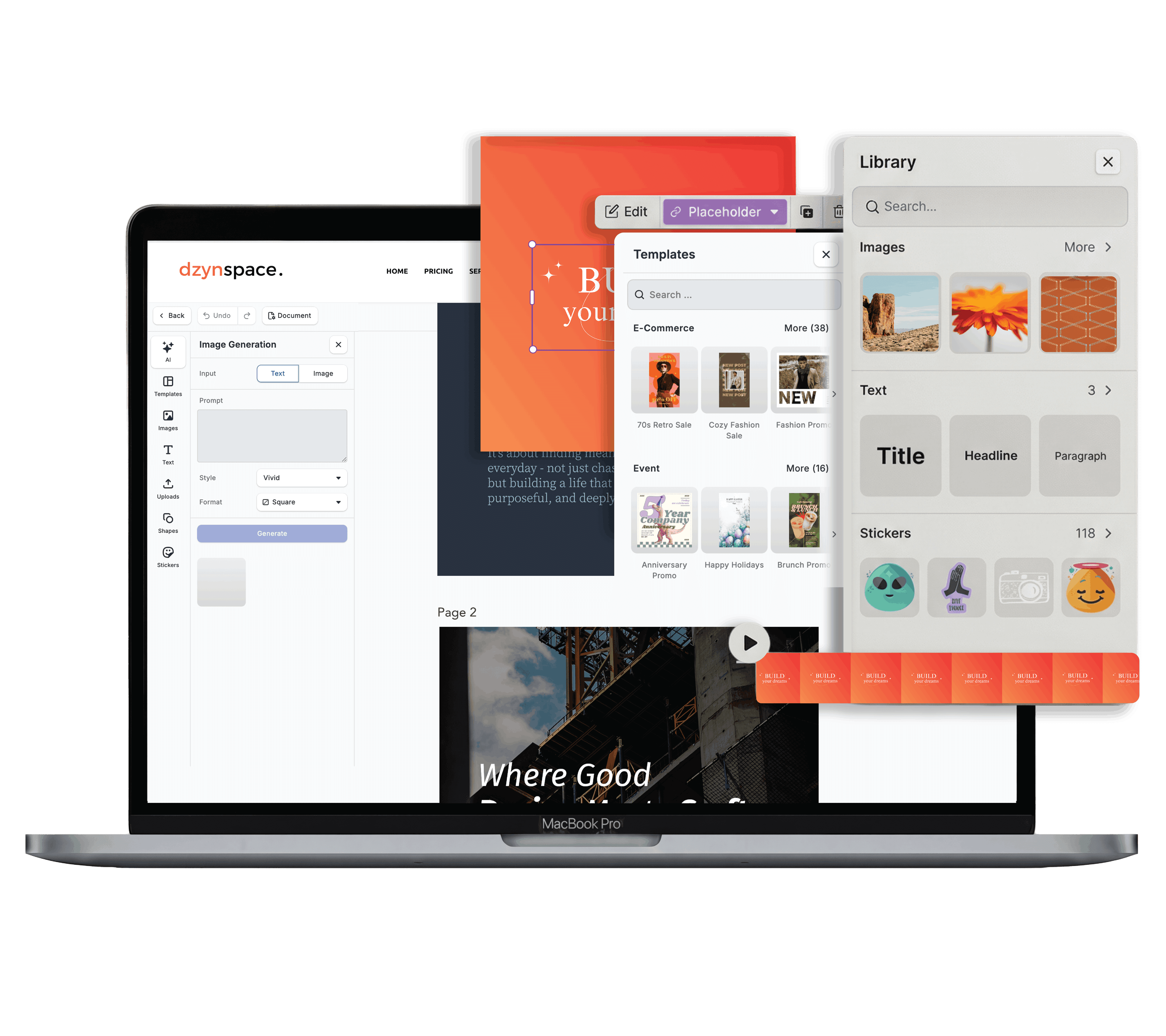
Instead of keeping your hex codes written down on a sticky note or hidden in an old email, you can upload them directly into Dzyn Space's native Brand Centralisation dashboard.
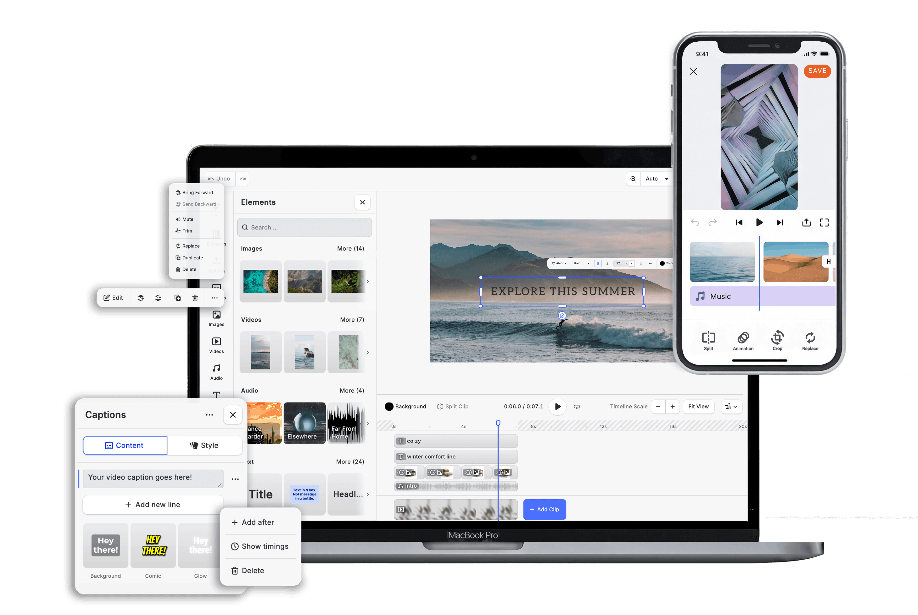
The moment you open the Dzyn Space Design Editor to customise an Instagram post, change a flyer template, or create a business card, your exact brand colours are automatically pinned to your editing toolbar.
You can change the background or text colour of any template to match your precise brand identity with a single click—ensuring total consistency across all your marketing channels.
Frequently Asked Questions
How do I check if my brand colours are easy to read?
Always prioritise contrast. Never place light yellow text over a white background, or dark navy text over a black background. For a deeper dive into the fundamental laws of visual hierarchy and legibility, read our comprehensive cornerstone guide: The Complete Guide to DIY Graphic Design for Small Businesses.
Where can I find pre-made colour palette ideas?
If you are struggling to find colours that match, websites like Coolors.co or Adobe Colour are excellent, free visual tools that generate beautifully balanced colour palettes automatically. Once you find a combination you love, simply copy the hex codes over to your digital brand kit.
Do my printed colours look exactly the same as my screen colours?
Screens emit light (RGB), while physical printing presses use ink (CMYK). This means colors can look slightly more vibrant on a backlit smartphone screen than they do on matte paper.
By designing inside Dzyn Space and printing locally through their built-in Print Monday integration, your files are pre-optimised to ensure your printed assets match your digital brand perfectly.
Conclusion
Choosing your brand colours is all about strategy, not just personal preference. By picking an industry-appropriate dominant colour, applying the 3-colour rule, and locking down your exact hex codes, you give your small business a highly polished, recognisable visual identity.
Stop guessing your colours by eye and wasting time hunting for design settings.
Simplify your visual identity today. Create your free Dzyn Space account, lock your brand colours into the cloud dashboard, and start creating beautifully consistent marketing graphics in seconds.